Scratch-made SVG Donut & Pie Charts in HTML5
Or how to write all that gobbledygook code yourself
A web developer’s kitchen is somewhat similar to a home cook’s. A developer has access to a variety of ready-made code libraries that will kickstart her web application in much the same way a home cook can utilize pre-made products to make preparing his meal more efficient. In both cases, the quality of what is pre-made should be considered highly important. Yet, sometimes this quality is sacrificed for the sake of convenience. Don’t get me wrong, convenience isn’t always bad. It can be beneficial when the trade-offs are known and properly evaluated.
When evaluating options for pie or donut charts in HTML, you really only have a few:
- Canvas element-based chart generated client-side (i.e. JavaScript)
- SVG-based chart generated client-side (i.e. JavaScript)
- SVG-based chart generated server-side
Ready-made Canvas & SVG JavaScript Libraries
JavaScript chart libraries are often more convenient and loaded with plenty of amazing options like interactivity. Here’s a few libraries:
With only a few lines of JavaScript and an array of data you can have a chart on your site in seconds. It’s no surprise that many choose this route.
So, why would you bother coding them by hand?
This is a great question, and I asked myself the same. In the end, I convinced myself of three things:
- Most of these JavaScript libraries have very poor accessibility, especially canvas element-based ones (with the exception of Google Charts).
- If the information in a chart is highly important (as it was in my situation), should we rely on a client-side script to produce the information? I don’t think we should.
- If I dive into the SVG code and get my hands dirty, I might learn a bit more about the underlying magical gobbledygook. In other words, learning might be fun and a worthwhile endeavor.
My Situation
My team needed a simple component that could be built server-side and display simple account usage information. In addition, our preference was to have this component be as light as possible (avoiding JavaScript if we could) — it didn’t need to be overly fancy or interactive, just a visualization of important data.
Side Note on Canvas Element-based Charts
You may notice (if you’re familiar with creating charts for the web) that I haven’t included Chart.js in my recommended libraries above. While you may certainly use it, you must keep in mind that Chart.js uses the canvas element to draw its charts, and the contents of the canvas element are not part of the DOM. Therefore, they are inaccessible to screen readers. This means you must take extra measures to ensure your data is even remotely accessible. Robin Rendle discusses this issue in his How to Make Charts with SVG post.
Enter CSS and SVG Charts
CSS and SVG charts are inherently more accessible and more semantic than other techniques. But, they can be daunting and possibly more time-consuming to code them by hand.
CSS-ninja Lea Verou offers a couple options for creating pie charts from scratch in her article Designing Flexible, Maintainable Pie Charts With CSS and SVG. Her techniques could easily be turned into a donut chart as well.
Robin Rendle also wrote about making charts using pure CSS, where he points out some downfalls to this approach too.
The Unexplained
I did some Googling on SVGs and SVG donut charts, and I came across the articles by Lea Verou and Robin Rendle (mentioned above) in addition to several others. Almost all discussed the use of SVG’s stroke-dasharray and SVG stroke-dashoffset attributes to position the pieces of the chart. These properties are identical to a “stroke” when creating vectors in programs like Adobe Illustrator.
Some of these articles even discussed animating the SVGs — which are great, but not exactly what I was looking for either.
After my research, I was able to understand that using an SVG <circle> with a stroke and stroke-dasharray could achieve the donut chart segments I needed. I also understood that stroke-dashoffset would allow me to “animate” or, in other words, position the segment where I wanted in the circle.
However, I couldn’t seem to find any clear explanation on exactly how the stroke dash attributes worked and how they relate to the circumference of the circle. What was more elusive was how I could chain several segments — one after the other — around the circle. Better yet, what was the formula to achieve these relative positions using the unique/dynamic segment sizes and the SVG’s stroke attributes?
So, I became determined to figure this out for myself.
Note: If you have discovered any resources that do explain these concepts, please share.
How to Make an SVG Chart by Hand
Stroke-dasharray and Stroke-dashoffset Explained
Let’s start with a simple SVG donut:

You’ll notice a few things:
- The radius (“r” attribute) looks absurd! Why? I wanted to make my segments sizes logical, digestible and human-readable. In order to accomplish this, I decided to base everything off of 100% (or a circumference of 100). SVGs are scalable, so it doesn’t really matter how big they are in the end; at least my math will be simple. Digging deep into what I remember from high school math, I know that the radius based on the circumference is: r = C/(2π), or r = 100/(2π). The result is 15.91549430918952. This is a crazy number with lots of decimals, I know, but it will make all of our lives easier later.
- The viewBox is set to “0 0 42 42”. This is meant to be double the cx & cy (center x and center y) values of the <circle>s and slightly larger than the diameter of the circles (including their strokes’ width).
- There’s a <circle> with a class of “donut-hole.” This is what makes sure the center is white. If you’re not concerned with that (in the case of a pie chart), then you can remove it.
- There’s also a <circle> with a class of “donut-ring.” This serves as a light grey backdrop when the segments don’t fill 100% of the circumference.
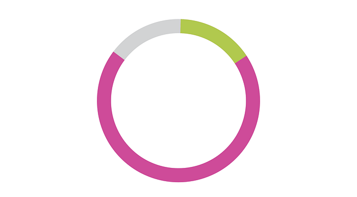
So, next we need to adjust the size of the segment to our desired percentage. Let’s use 85%:
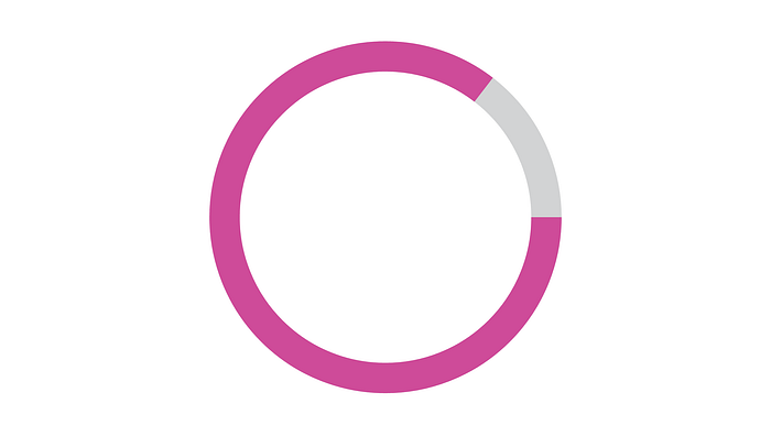
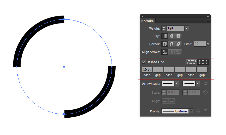
The segments are created by using the SVG stroke attribute called stroke-dasharray. The value we’ve set in the above example is “85 15”.
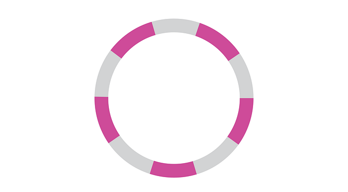
If we think of this as a pie, then having an 85% segment means there would be 15% of the pie remaining. These two values are an array delimited by a space. What is happening is a dashed stroke is created over 85 units, then a gap for 15 units, then a dash for 85 units, then a gap for 15 units, and so on and so on. But since we’re using a circle and the values total 100, this just repeats itself once around. If we didn’t make the second value in the array add up to the 100 total, then we’d get a third dash (or part of one) or more. For example, here’s a stroke-dasharray of “10 10”:
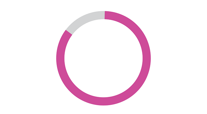
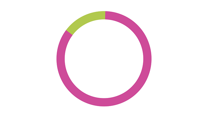
Now, in Figure 2 and in Figure 3, you may notice that the stroke-dasharray doesn’t start at the very top (at 12:00). Instead, it actually starts on the right side (at 3:00), and it moves clockwise around the circle.
If we want to position (or start) at the top, then we need to use stroke-dashoffset. However, unlike stroke-dasharray, stroke-dashoffset moves counter-clockwise. So, we’d need to set this value to “25” (for 25% in the opposite direction from 3:00 back to 12:00). Remember it’s not a negative number, because offset moves counter-clockwise.
How to Position Donut Chart Segments Around an SVG
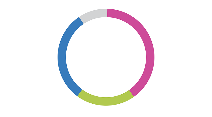
Now we need to add additional segments around the circle. Let’s use a segment that’s 15% of the circumference. The remaining percentage for the stroke-dasharray would be 85 — independent of any other segments. Thus, the code would look like this:
We’ve left the stroke-dashoffset at 25, so the new green segment begins at the top and runs clockwise overlapping the first segment (in pink).
Obviously, this isn’t exactly what we want. We want the 15% segment (in green) to fit snuggly in the space left by the 85% segment (in pink). We could adjust the stroke-dashoffset until we get lucky, but this wouldn’t work easily if we had more than two segments. Instead, we need a formula:
Circumference − All preceding segments’ total length + First segment’s offset = Current segment offset
Plugging in our numbers, we have:
100 − 85 + 25 = 40
Adding More Slices to the Pie (er, Donut)!
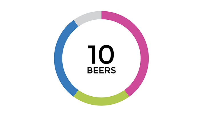
This same formula works to add additional segments. Let’s fill the chart with 40%, 30%, and 20% with 10% unused.
The code:
The result:
Adding Text Inside the Donut Chart
It wouldn’t be a donut chart without the text inside the middle — that’s what the hole is for right? Well, adding text is simple. We just use the <text> element that is native to SVGs.
You’ll notice that I’ve split the chart text into 2 <text> elements and grouped them (<g>). This is so we can stack the label and its value on top of each other more easily and position them as one unit. I’ve set the X and Y attributes to begin in the center of the SVG at the baseline and left-aligned.

As you can see, this positioning isn’t quite right, so we’ll have to spruce it up with some CSS:
First, let’s add the font Montserrat (simply because I love it). Then, we need to adjust the font-size and line-height. After adding in a “translateY” of 0.25em, the text aligns a bit better vertically, but we’re not out of the weeds yet.
We need to make both text blocks smaller and align them in the center by adjusting the font-size to where we like it (0.6em for the larger-sized number and 0.2em for the label looks about right) and using the “text-anchor” property with a value of “middle.”
Now the text is in the center. All that’s left is to make the text uppercase (easy to do) and position the individual text elements using “translateY” so that they stack properly. We now have this:
Accessibility Concerns
As I mentioned earlier, SVG contents are part of the DOM so they are inherently more accessible. This makes it incredibly easy to provide additional context for screen readers through attributes and caption-like elements.
The first layer of concern for accessibility should be to make this SVG chart more semantic by wrapping it with a <figure> element since it’s a diagram. As a figure, we can take advantage of the <figcaption> element to provide a caption or description for the donut chart.
In addition, we can add the <title> and <desc> content tags (which are native to SVGs) and link these with ARIA labels, IDs, and a role to provide more context to screen readers.
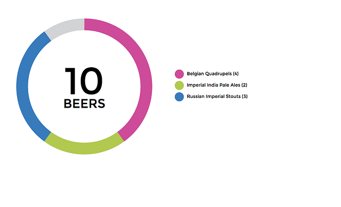
We can add a color key as part of the <figcaption> for the chart as well, marking it with a role of “presentation” and an aria-hidden attribute since it’s really meant as a visual aid. For screen readers, there’s a more descriptive explanation in the <figcaption>.
With some CSS Flexbox magic, we can position the key off to the right and vertically align it with the chart. Giving us our final product:
Since the CSS styling in the key with border-radius and Flexbox could each be their own article (the latter requiring a much longer explanation), I’ll leave these topics for another day.
Final Takeaways
As I alluded to earlier, coding SVGs by hand can be time consuming, especially considering the fact that there are so many great JavaScript libraries out there that would build them for you. But, there may be instances (like my situation) where you or your team needs a method that doesn’t involve JavaScript — one that’s built server-side.
The good news is that once you figure out a system like this, it can be easily applied elsewhere with little effort. Plus, getting your hands dirty in SVGs is a good way to learn more about how SVGs work and the advantages of using them.
My takeaways:
- Math applied to something like this is way more fun than it was in high school.
- In hindsight, the logic behind stroke-dasharray and stroke-dashoffset are not as complicated as I initially thought.
- Don’t forget to add the extra layers of accessibility. After all, accessibility isn’t just about catering to screen readers. It’s about making your content more accessible and more consumable by all people and all devices (including search engines). If your JavaScript chart library doesn’t have accessibility features, consider improving it.
Comments & Feedback
I am interested to hear everyone’s thoughts and feedback on making SVG charts by hand, my methodology in creating them, and SVG accessibility in general.
Edit, January 23, 2017: It’s come to my attention now that Internet Explorer 11 and Microsoft Edge don’t support CSS transforms on SVG elements. This sucks. But, if you’re only using 2D transforms you can use the transform attribute on the <text> elements themselves to position the text. Or, do a sort of bastardized feature detection to target IE11 and Edge like I did, and fudge it from there. Not totally elegant, but I was limited to finding either a pure CSS or a JavaScript only solution for my current circumstance. If you know of another, more elegant solution, please let me know!
Edit, August 25, 2016: Previously, I positioned the text inside the donut using the dominant-baseline property. But, I found this method a lot more convoluted as well as not as reliable across browsers (I’m looking at you Safari). I have edited this post to reflect a better, and far simpler cross-browser solution using only “translateY”.